
The laws of Gestalt are psychological principles that describe how we perceive and organise visual information. These laws or principles are based on Gestalt theory, which originated in early 20th century Germany by three psychologists: Max Wertheimer, Wolfgang Köhler and Kurt Koffka. Since then, its use has transcended psychology to creep into other domains such as design. Nowadays, the laws of Gestalt are a fundamental axis of the practices of UX design/UI.
Although we can read the principles of Gestalt and not find a practical application in design at first glance, they do have an unquestionable validity. In this article we are going to explain in detail what the principles of Gestalt in design are and we will illustrate them with textual and graphic examples so that you can internalise its use when designing prototypes for app interfaces and other types of software.
Principle of similarity
Under the principle of similarity, it is assumed that people tend to relate to each other in a similar way. elements that share some visual characteristic. It is not that they must be identical in appearance, but simply show a common feature such as colour, shape or size.
This principle differs from the others because it transcends the spatial distribution of the elements. In other words, in order for us to visually connect the elements on the basis of the principle of similarity these do not need to be placed in an order, by pattern or proximity. When we mix a hodgepodge of elements that share characteristics with another group of mismatched elements, our brain will automatically try to establish visual associations to mentally group the elements that are similar to each other, and separate the mismatched ones.
In UX design, the principle of similarity serves not only to group elements that are semantically related to each other, but also the opposite: to emphasise certain elements by dissimilation. This is why anchor texts in links often be highlighted in a different colour from the rest of the text. In the same way, websites play with typography in order to highlight the parts that are of most interest to the user.
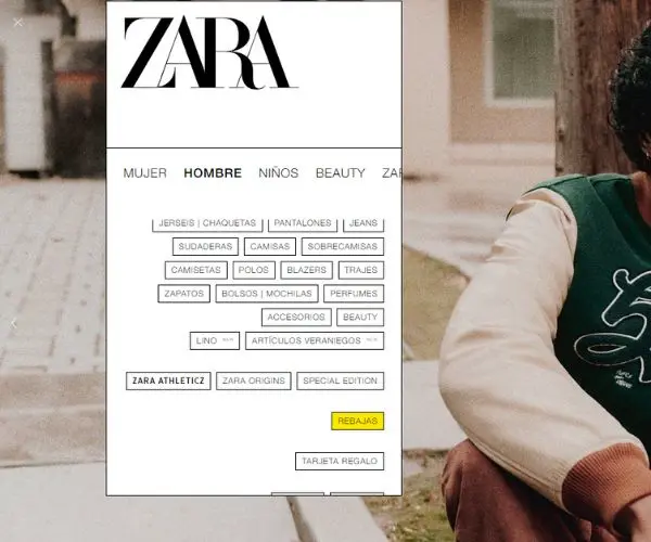
In this diaphanous category navigation menu of Zara, we see how the Gestalt principle of similarity is broken for a good reason. All the buttons share the same colour and form a compact group in the eyes of the user because of their similarity. However, this chromatic harmony is disturbed by a bright yellow button for sales, which impertinently catches our attention.
Principle of figure and substance
This principle of figure and background consists of two obvious elements: the figure (the element to be emphasised) and the background (the less important element that supports the figure). When viewing an image, our eyes instinctively move towards what they consider at first glance to be the most relevant. (the figure) and ignore what is not so important (the background). In this way, our brain perceives the figures as elements in front, and the background as a set of elements further away.
This principle is easy to see in the prototyping of applications and software programs. For example, the standard background of many blogs and websites is white, or a variation of it, because it is a colour that is easily perceived as a background and where it is easy to highlight elements.
Another more widespread example of the figure and background principle is found in many forms. If they are well designed, text boxes protrude so that the user knows where to type your information. In addition, when the user clicks on a form element, it is highlighted so that they know where they are about to type.

Mango shows us a very simple example in one of its homepage offers: a dark, unadorned background from which a headline in lower case and nuclear white stands out next to a button with a filler in the same colour to invite the conversion directly.
Principle of continuity
Before explaining this principle, we will illustrate it with a very simple example: the dashed line of a long road stretching to the horizon. As soon as you look at it, you can't ignore it. This is because our brain gives preference to elements that follow a regular pattern over elements that are out of place in disharmony.
Respecting the principle of continuity is therefore particularly relevant in UX because it allows the user to move smoothly and logically through all points of a website or application in its interface. To do this, the interface needs to a consistent design, employing patterns and which does not behave in a way that is outlandish or confusing to the user. Good user-centred design is intuitive because of its continuity, in that the user is able to navigate autonomously through the application without much cognitive effort.
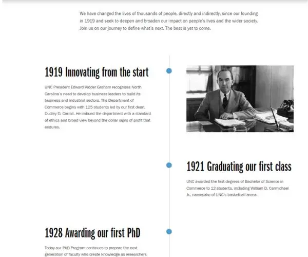
In this chronology within the About Us section of the Kenan Flagler Business School website, we see how a continuous line with irregular dots is used, extending from top to bottom, displaying blocks of information in a zigzagging pattern.
Principle of closure
This principle of closure can be seen in use in many optical illusions. In Gestalt it is described how the human brain is able to connecting visual cues to visualise a figure where there is none, It is partially hidden or cut off. The closing principle is very attractive to the eye if used wisely, and is often successfully exploited in the creation of logos.
We also see this in some minimalist websites that generate negative spaces between figures so that the brain fills in the gaps. However, the most widespread and well-known application of the closure principle in UX and UI is that of carousels.
For example, when accessing Instagram, we see that the stories are organised in a carousel that overlaps, cutting off the users' photo, leaving our brain to complete this pattern of figures. In this case, the closing principle intuitively lets the user know that the carousel of stories continues.
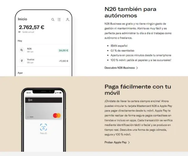
Finding clear closing examples on websites is more difficult, but the digital bank N26 provides a simple but ideal example to illustrate the closing principle. In two different blocks, a mobile phone statement is shown. It is not necessary to show the entire screen of the mobile phone, as our mind will fill it in automatically. To exploit the closing principle, the first mock-up extends the screen into an animation.
Proximity principle
This is perhaps the most elementary Gestalt principle in UX. It consists of the fact that we tend to relate between each other elements that are in close proximity to each other, while those in the distance are perceived as different elements.
This is a very important guideline because users tend to scan everything we see on screens very quickly, especially on mobile phones, so a good design should group elements that are related to each other by proximity or remoteness so that the user can easily identify them.
The way to generate this proximity or remoteness between elements is simple: through space, emptiness. Space in UX design lets us breathe, but it also marks the semantic connections or disconnections between groups of elements. We can play with various design elements to stimulate users to perform a certain action.
For example, in newsletters the unsubscribe button is often placed very far away from the rest of the subscription The use of body text to discourage users from leaving the email stream for good.
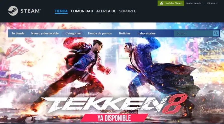
In this Steam image, we can see how there are two navigation bars that are not grouped together, but with the two elements harmonised by their proximity. The principle of proximity is applied in such a way that the Store, Community, About and Support buttons are aligned in a single set, while the six buttons of the lower navbar are associated within a separate set. On the other hand, in the top right corner we see the login, Steam installation and language buttons grouped together.
Principle of symmetry and order
This law of Gestalt dictates that humans perceive symmetrical and orderly as more pleasing and balanced to the eye. than compositions with asymmetrical or misplaced elements. In a way, it has its philosophy behind it: symmetrical is perfect, flawless, a mirror image in which everything is ordered. However, not every interface of a website or application needs to be symmetrical. If symmetry is abused too much in UX design, we will tend to create very intuitive interfaces, but too boring.
The priority of symmetry and order is to avoid unnecessary distractions so that the user can focus on what we really want to bring out. In any case, symmetry does not have to be absolute, but structural, e.g. with adjacent even blocks equal in size and shape.
At the same time, if we follow a symmetrical design, it is easier to highlight certain elements of interest; we only have to break the symmetry to redirect the user's attention.

In this screen example from TheBodyShop we see an image of selected products arranged in a perfectly symmetrical way, which creates a calmness to the eye and a sense of uniformity that is not distracting. There is only one detail that breaks the perfect mirror symmetry and order: the “favourite” circle in the centre of the set of elements, which coincidentally highlights the most expensive product.
Principle of common leadership
Although this principle was not included in the original Gestalt laws, it has been incorporated because of its great usefulness when designing interfaces in which some movement or illusion of movement is applied. According to the principle of common directionIn this way, our eyes group together sets of elements which, although clearly divided, point in the same direction. or move in the same direction.
A practical example of this principle outside UX design can be seen in the flocks of birds that, when flying in a group towards the same point, form a characteristic shape before our eyes that we perceive as a whole.
In UX design, the common law of direction applies not only to moving elements, such as screen transitions, but also to elements that give the illusion of movement, such as arrows.
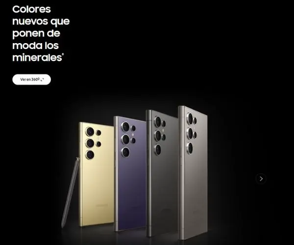
Finally, Samsung shows us a perfect graphical example of the attractiveness of the well applied common direction principle. In this image we see how the four mobiles on display all face in the same direction, including the clickable arrow on the right. Clicking it will take you to another screen with another set of four mobiles facing, this time, in the opposite direction.


 Español
  English (UK)
  Français